
Back in March Chanel discontinued some of their eye shadow palettes in Europe and released eight new palettes. I am really hooked into their new formula. The more I try it, the more I love it. A few days ago the new quads started appearing at counters all around the world, so I decide to share my thoughts on the ones I haven't reviewed yet. You can check out the previous reviews here:
Today I would like to write about the blue palette of the new line, #224 Tissé Riviera.
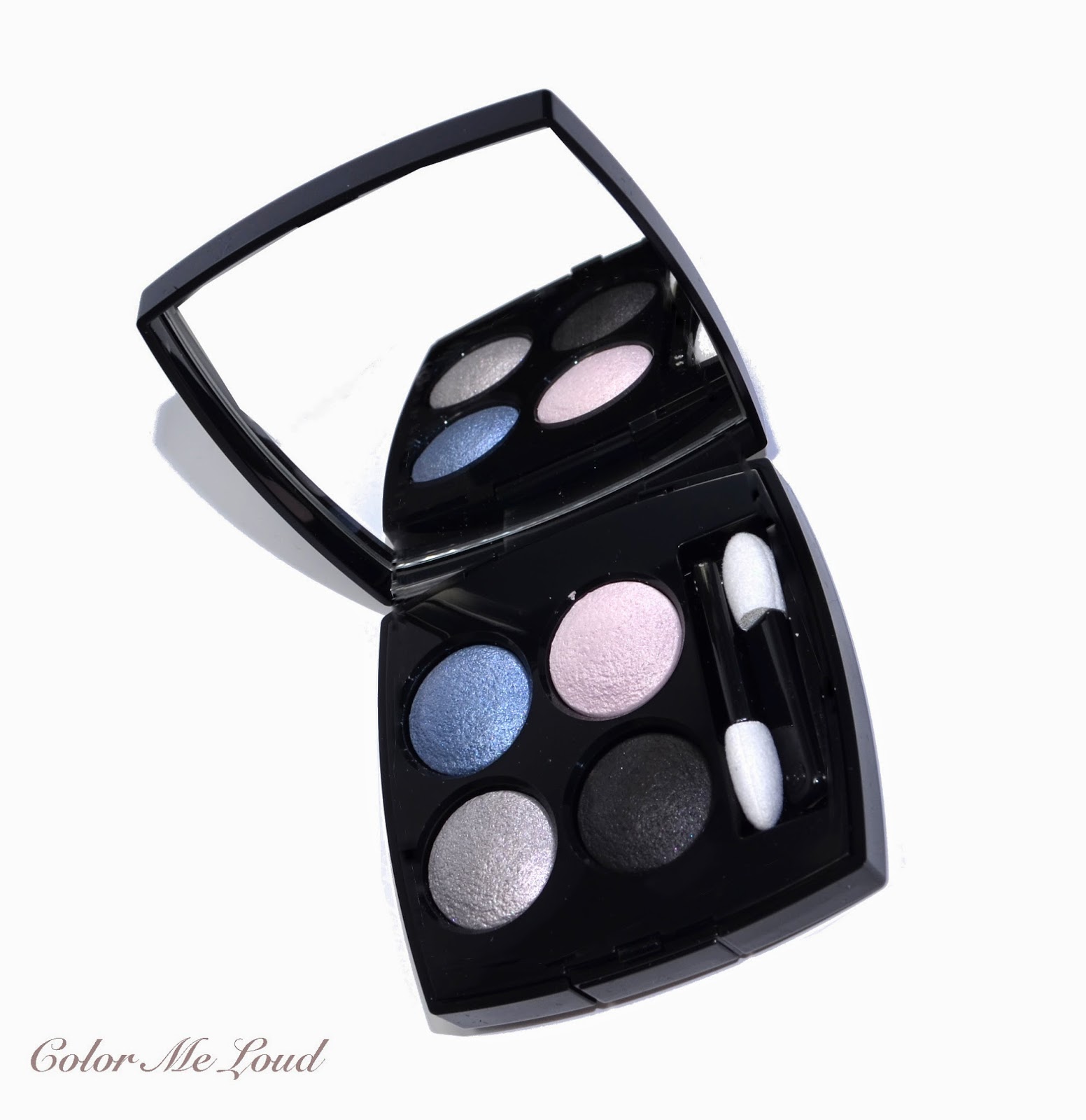 |
| Chanel Les 4 Ombres #224 Tissé Riviera |
Most of the eight new palettes are presenting a natural to warm color selection but Ice Queens out there will certainly like #224 Tissé Riviera with its blue and silver tones.
 |
| Chanel Les 4 Ombres #224 Tissé Riviera |
The finish of Tissé Riviera is similar to that of Tisse Venitien and Tisse Rivoli with a lovely metallic but not over the top touch on two main shades. Deepest shades has satin to matte finish which is great for definition as well as a liner. The shades in the palette manage to stay not too pastel nor too grey/classical smokey.
 |
| Close-up: Chanel Les 4 Ombres #224 Tissé Riviera |
Top left: Medium blue with grey undertones and metallic finish. Although the shade of blue is close to being pastel, the metallic finish gives it an extra dimension and turns it into a complex lovely shade of blue.
Top right: Very light pink with satin finish. It is great for highlight on the inner corner as well as under the brow bone.
Bottom left: Light slate grey/silver with metallic finish.
Bottom right: Very deep cool black with satin to matte finish. This shade of black is one of the best I own at the moment, the texture is great and it is very pigmented and deep.
 |
| Swatch: Chanel Les 4 Ombres #224 Tissé Riviera |
Below I used the blue shade from middle to outer lid and silver at inner to middle upper lid. I then defined the look with the black on the crease, which I used sparingly. I blended the crease with the light pink and dusted a little bit of that under the brow bone. I combined this look with Urban Decay 24/7 Eye Liner in LSD along the upper lash line and Chanel Le Volume Mascara on upper and lower lashes.
 |
| In-action: Chanel Les 4 Ombres #224 Tissé Riviera |
Here is the whole look with some other make-up on my face but I don't remember what exactly they were... It has been almost a month, so I hope you excuse me for that. If you are especially curious about something, I can try to find it out. With these cool blue grey eyes, I like wearing light blush and nude lips with some warmth to it, like apricot tones. I think this way the whole look gets more neutral than cool.
 |
| FOTD: Chanel Les 4 Ombres #224 Tissé Riviera |
I have recently received e-mails from readers asking about comparisons between the texture of quads from different brands. I can safely say that I like Chanel's formula much more than YSL's new formula which, to me, is a little too soft and has tendency of blending itself to nothing. Chanel's formula though is soft and creamy but it stays put and different shades show up wonderfully. I also like the color concepts of Chanel's Quads more.
Check out more swatches of Tissé Riviera at Indigo Kir Royale.
 |
| Chanel Les 4 Ombres #224 Tissé Riviera |
Final thoughts: Another thumbs up for Chanel's new formula. These are now arriving to all the Chanel Counters so in case you haven't tried them yet, I strongly recommend checking them out.
I will review the last three palettes also soon. Just a little spoiler, the ones I have already reviewed are my favorites in terms of formula and shade combinations.
Do you like warm (corals, apricots) or cool (pinks) lips with blue eye shadows?
hi sara!! i'm trying to figure out the time difference between germany and ohio. your post is dated sunday and it's saturday night here. i guess when i wake up tomorrow it's night for you. i like both...i love a good coral lippie but, i have trouble finding one i really like. chanel had a great coral glossimer (i think from summer 2012) but it was limited edition. i don't care for pink on me. i'm also looking for a great nude/ beige lip color. i think my local chanel counter has 1 of the newest quads out right now. it's the same one listed on chanel.com. poesie?? not sure if that's the correct spelling. i'm curious why it's just 1 name and not tisse in front. as you can tell i know beans about french. i wonder if this particular quad lacks the "tweed effect" as mentioned of the others. it interest me that they are all labeled limited edition. i'm holding off going to my local counter until this thursday when nordstrom starts their anniversary sale early for nordstrom credit card holders only. i'm not sure if "poesie" is in their exclusive anniversary collection. there will be a limited number of highlighter compacts. i'm sure you have reviewed it before. that shadow looks lovely on you. i will probably choose a more neutral pallette that is considered more work appropriate for me. xo.
ReplyDeleteHi Wendy,
Deleteif you want to go more natural, make sure to check out Rivoli. Those are all released at the moment, at least I see them listed at Chanel.com. There is also Mademoiselle but I love Rivoli much more. You might as well check out Vendome, it is natural but still fun with a touch of peach to compliment the khaki tones. You might tell that I love the new formula of Chanel, might be one of my top 3 e/s formulas ever. I know which glossimer from Summer 2012 you are referring too, Calypso! I love that one and have a back up of it :-) Oh and time difference should be around 6 hours :-)
This quad looks beautiful on you!! I got Venitien and Vendome last week, and I have to say Venitien is extraordinary!! No wonder it's the quad they used on the campaign and display pictures! I agree that the
ReplyDeleteChanel is less likely to blend into one colour, and in that sense is easier to use. I find the YSL to be softer shimmer, and the Chanel to be more sparkly sometimes, but beautifully and flatteringly so.
I am feeling exactly the same about Chanel, it is a little more metallic but looks so flattering. I don't understand though how they managed to get those metallic shades without any fallout LOL. Oh and Venetien is a real stunner. I love Vendome too, for everyday use it might be my pick from the collection and I don't even like khakis! I think you have picked up the best. You may still want to check out Rivoli too ;-)
DeleteLove it! I wasn't digging the new YSL eyeshadow formulation...Kinda want the fall palette but at the same time, not really! These though, sound like something I'll get along with ;)
ReplyDeletewww.lilting-grace.blogspot.com
Hi Miss Louise,
Deleteyou are right, those are much better in terms of texture and shade combination, so you should really check them out. Let me know which one you picked too!
Sara, this quad looks beautiful on you! It would be too cool-toned on my warm complexion, but the blue shadow really compliments you well. I also prefer warmer lips to balance a cool-toned eye. I really like the look of the apricot lip color you chose!
ReplyDeleteHi Carolyn,
DeleteI might be a little cooler than you but all in all I am warm as well (or natural I would say) so I think I needed to warm up the things a little to make them work. Thanks for your lovely comment and kind compliment :-*
Gorgeous, just gorgeous but that blue scares me! As for corals or pinks, I'd go according to what I'm wearing since I like both. :)
ReplyDeleteHi Helene,
Deletewhy are you scared of blue? LOL. You are right about matching the rest of the makeup to the outfit I guess. I will try a hot pink top and let's see how it all looks like ;-)))
Hey Sara, I think Tissé Riviera suits your complexion nicely! I can probably rock the blue and black shades but the other two I'm afraid might be too cool-toned for me. I was curious how the Chanel quads compare to the YSL ones, so thanks for clearing it up! :)
ReplyDeleteHi Jaa,
DeleteSilver is a little cool but can be used sparingly. I am sure you will like the warmer quads more though, like Rivoli or Vendome, or Mademoiselle if you like naturals. I can't wait for your close-ups to see these palettes from another point of view, so exciting. Thanks for stopping by :-*
The colours in the quad are so gorgeous! It's the kind of blue that is bright enough to make a statement, but muted enough to be worn all year round. I bought Tisse Venetien as soon as it was out in the UK. Actually, I had absolutely no intention of getting anything from the line at all as I never like the Chanel quads, but I happened to walk past the display whilst on an errand and decided to play a little. Tisse Venetien was breathtaking, and the bottom two colours had something unique about them. It came home with me that day.
ReplyDeleteHowever, I restrained myself and only came away with one and a few months later I still have only one, only because I think I'm reaching that point in my collection where if I buy anything, I will inevitably buying a duplicate. I have an older Dior quint that looks very similar to Tisse Cambon so I don't mind missing that too much (but pink and purple eyeshadow! how much longer can I resist?) but the other one I want is this one.
Do you think if I already have last summer's Le Stylo Eyeshadow in Blue Bay as well as Destination and Apparition Illusion D'Ombres from the summer before that I need this one? More specifically, is the top-left blue similar enough to any one of those that I can skip it? Would really appreciate your opinion if you have the time.
Leila
Hi Leila,
DeleteI have checked the comparison post of Blue Bay
http://www.colormeloud.com/2013/04/chanel-stylo-eyeshadow-47-blue-bay.html
Destination is the closest among them, but it is more sparkly than the blue in the palette. Also Blue Bay is more sparkly, blue in this palette is satin to metallic and more grey if that makes sense. All that said, of course if you have Destination and some good black and a metallic silver, you might recreate the look. You like cool eye shadows? Because I think Vendome and Rivoli are also very nice.
What a gorgeous, colourful quad! Love blues for summer. Nice to hear that the texture of this one is also spot on :)
ReplyDelete-Jen
www.vibrantbeautyblog.com
Hi Jen,
Deleteyes I like blue for summer too, especially if I get a little bit tanned they look better :-)
Textures of these are to die for.
Xox
Lovely, Sara! I agree... somehow I'm gravitating more to the color story of these Chanel Les 4 Ombres a lot more than the YSL Couture Palettes. This is the first time I ever feel like I need to collect them all!
ReplyDeleteHi Linda,
Deletethe same here, all the shades are different enough to justify a palette and they combine nicely. I have unfortunately already collected those, I am hoping the rest of the palettes from Chanel are all going to be in this kind of texture.
I was thinking I didn't need this one, but think you have now changed my mind, love these colours on you x
ReplyDeleteHi Clare,
DeleteI am sure this one will look even better on you, given that you have a cooler complexion and stunning blue eyes :-)
That blue is stunning on you! I wonder how I'll go with it. I can't wait to get mine in the mail.
ReplyDeleteHi, I hope you are loving it! :-*
Delete