
Spring Collection from Chanel was launched almost three weeks ago in US. Last week I spotted the items in some counters in Stuttgart but they are still not available online. Because of an issue with a lost package between US and Germany (the second one in the last two months), I was trying to resist purchasing some items considering the case of a rare event of the package being found (!). Still two of the nail polishes came home with me. Today I would like to present you Chanel Le Vernis #605 Tapage and #603 Charivari.
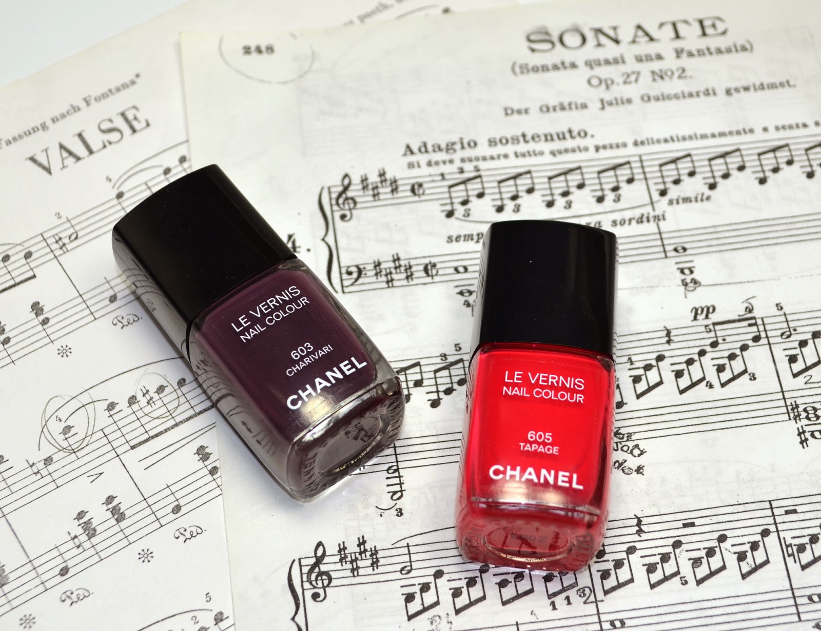 |
| Chanel Le Vernis #605 Tapage and #603 Charivari from Notes de Printemps Spring 2014 Collection |
Note to myself: Get some scores of Stravinsky for the next Chanel post, fits better than Moonlight Sonata ;-)
Le Vernis #Tapage is a bright pinkish red shade with creme finish. It has a very good consistency and is opaque almost with one coat. As the name Tapage suggests (noise in french), this one is not that subdued. To me it has a cheerful and easy going nature, perfect for spring and summer.
 |
| Swatch: Chanel Le Vernis #605 Tapage (without flash) |
 |
| Swatch: Chanel Le Vernis #605 Tapage (with flash) |
Tapage is once red, once pink and even a little orange. I pulled out some similar colors from my stash to see if I had something similar.
 |
| Chanel Le Vernis #605 Tapage and similar shades from my stash |
Chanel #581 Cinema (reviewed here), Chanel #129 Image Rose (discontinued) and Chanel #589 Elixir (reviewed here) are all much darker than Tapage. Chanel #441 Cherry is lighter although it is the only shade which is swatched with three coats below. Tom Ford #14 Scarlet Chinois is probably the most closest I have, which is a tad darker and redder. Chanel #677 Rouge Rubis from 2013 Holiday collection is also slightly darker but close. Tapage is like a care free cooler younger sister of Rouge Rubis.
 |
| Nail wheel comparison of Chanel Le Vernis #605 Tapage and similar shades from my stash |
Another loud music in repertoire of Chanel for this Spring is #603 Charivari. As I love wearing dark nail polish, I was most excited about this one. It is a deep aubergine creme with a slight milky quality to it which makes it different than the other Chanel vamps. The consistency is again very good, I used two coats for swatches but could easily stop at one.
 |
| Swatch: Chanel Le Vernis #603 Charivari (without flash) |
 |
| Swatch: Chanel Le Vernis #603 Charivari (with flash) |
I knew that the comparison of Charivari wouldn't be easy given the number of Vampy polishes I own. Here is an attempt...
 |
| Chanel Le Vernis #603 Charivari and similar shades from my stash |
Below I swatched every shade with only one coat since it is easier to spot the difference of such dark colors by doing so.
Chanel #599 Provocation, #573 Accessoire and #18 Rouge Noire and #113 Koala (discontinued) are all redder and doesn't have the blue hues of Charivari.
Chanel #583 Taboo is more purple and has red shimmer. *sigh* Each time I swatch it the beauty of this one still make me sigh.
Tom Ford Bitter Bitch appear very close in the bottle but once swatched, it is warmer, pulling more brown.
YSL #40 Sepia 4E Art is more purple and a tad lighter.
Chanel #509 Paradoxal and #603 Charivari are close but Charivari is darker, less milkier. Paradoxal additionally has a gorgeous shimmer which makes it appear more complex on the nails.
Chanel #563 Vertigo, which is one of my favorite Vamps from Chanel to date is very close to Charivari but I find Vertigo prettier on me since I like its reddish hidden shimmer of it.
 |
| Nail wheel comparison: Chanel Le Vernis #603 Charivari and similar shades from my stash |
Final thoughts: Two new nail polishes from Chanel are a dream to work with. These are also a kind of alternative to the "occupy pastel movement" for Spring, which is really a good thing if you want to escape from girly pinks and pretty baby blues. You may still want to check your stash first though, since it is very likely that you have something similar in there.
Vamp on the nails for Springs? What do you think?
I just applied Charivari on my nails about 2 hours ago! Love it! You're so right about the formula, real easy to work with. I'm not sure about Tapage yet. It is a stunning color but I find it a little red for my taste but it could be fun for summer. :)
ReplyDeleteHey! We are nail twins at the moment than, I am wearing Charivari while typing this too! Yay! :-)
DeleteYes both of the polishes have great formula, I think Chanel's formula improved in the last years, like since early last year their polishes are almost one coaters. Tapage is not a classic red but in the end it looks red on the tips, so if you don't like red nails, probably that one is not for you.
Hi Sara! Thank you for sharing your comparisons, Tapage was a one coat wonder but I passed on both. I actually wore them for a full day and tried to love it but just couldnt. There are better vamps and red in my stash and these days I only buy what I would use.
ReplyDeleteHopefully this decision doesnt come back to haunt me ;D
Hope youve been well!
Hi Xen Lee!
DeleteLong time no see, I was wondering how you are doing. I am fine thanks, started to work after a long break, still trying to get used to it. ;-)
About what you have written, I feel you... I also have other vamps which I like more. I was expecting a little more something I guess and I might have not purchased these if I weren't collecting.
Great swatches and comparisons! as usual :) It's been very helpful to me to come to a conclusion: I won't purchase any of those. I'm pretty sure I already have a dupe for Tapage in my corals and Paradoxal is similar enough (seen from afar) to spare me the purchase of Charivari. I guess I'm going to splurge on Dior nail polish this Spring instead, because I'm in the mood for some pastels :)
ReplyDeleteHi Natalia,
Deleteglad it was helpful. If I were to pick one, I would go also with Vertigo or Paradoxal, both of which I like more. Dior nail polishes are interesting but partly a little sheer so do check out before deciding, I will post about the other two tonight or tomorrow night, it might help you on your decision too.
Xox
Hey Sara, thanks for the swatches! I personally welcome the change! I have Charivari and I like how Tapage looks as well. I still remember Fracas from last year with a lot of fondness!
ReplyDeleteHi Sunny,
Deletewe all need a little break from the pastels don't we? ;-)
I hope you enjoy Charivari too and given the fact that how well you carry reds, maybe you should get Tapage too! ;-)
Both look great, especially Charivari even when I think it might be similar to Guerlain Holiday 2013 Sulfurous.
ReplyDeleteHi Anne,
DeleteSulfurous has a metallic/pearly finish. Charivari is pure creme. You are right about the shade though, they are close but finishes are different, hope it helps.